A call-to-action (CTA) is a crucial component of any website, serving as the bridge between your content and desired outcomes. Whether you’re looking to increase sales, grow your email list, or generate leads, an effective CTA is essential in guiding users toward taking the desired action.
In this article, we will examine the importance of an effective call-to-action, and provide actionable tips to help you create a winning CTA that drives conversions and boosts your bottom line.
Understanding the Purpose of a Call-to-Action
A CTA is essentially a prompt or button that encourages users to take a specific action on your website. It can come in many forms, including buttons, text links, or even pop-ups. The main purpose of a CTA is to lead the user to a landing page where they can take the desired action, such as making a purchase, downloading a resource, or submitting a form.
For example, CTAs may include opportunities to:
- Sign-up
- Subscribe
- Learn more
- Read more
- Get started
- Try for free
- Join us
- Share on social media
- Free trial
- Buy now
- Add to cart
- Checkout
- Add to list
- Download
Key Components of an Effective Call-to-Action
An effective CTA contains several key components, including:
- Clarity: Your CTA should be clear and concise, conveying the desired action in a straightforward manner. Avoid using overly complex or confusing language that may lead to confusion or frustration.
- Urgency: Urgency can be a powerful motivator, and incorporating elements such as limited time offers, scarcity, or a sense of urgency can help drive conversions.
- Motivation: Your CTA should clearly convey the benefits of taking the desired action, and provide a compelling reason for the user to do so.
- Placement: The placement of your CTA is also important, and it should be prominently displayed where the user can easily see it. This may include above the fold, in a side bar, or as a pop-up.
Crafting a Compelling CTA
To create a winning CTA, consider the following tips:
- Keep it simple: Use simple, straightforward language that clearly conveys the desired action. Avoid using complex language or technical jargon that may confuse or frustrate the user.
- Use action-oriented language: Use words that encourage the user to take action, such as “click here”, “get started”, or “download now”.
- Make it visually appealing: Use eye-catching design elements, such as bold colors, contrasting text, and clear font choices, to make your CTA stand out.
- Test and refine: A/B testing is a powerful tool for refining your CTA, and you can use it to determine what works best for your audience and make ongoing improvements.
Call-to-Action Examples and Why They Work
For inspiration, check out how others are successfully using a call-to-action to further their marketing and business goals. Here are examples to get you started.
#1 Atlassian
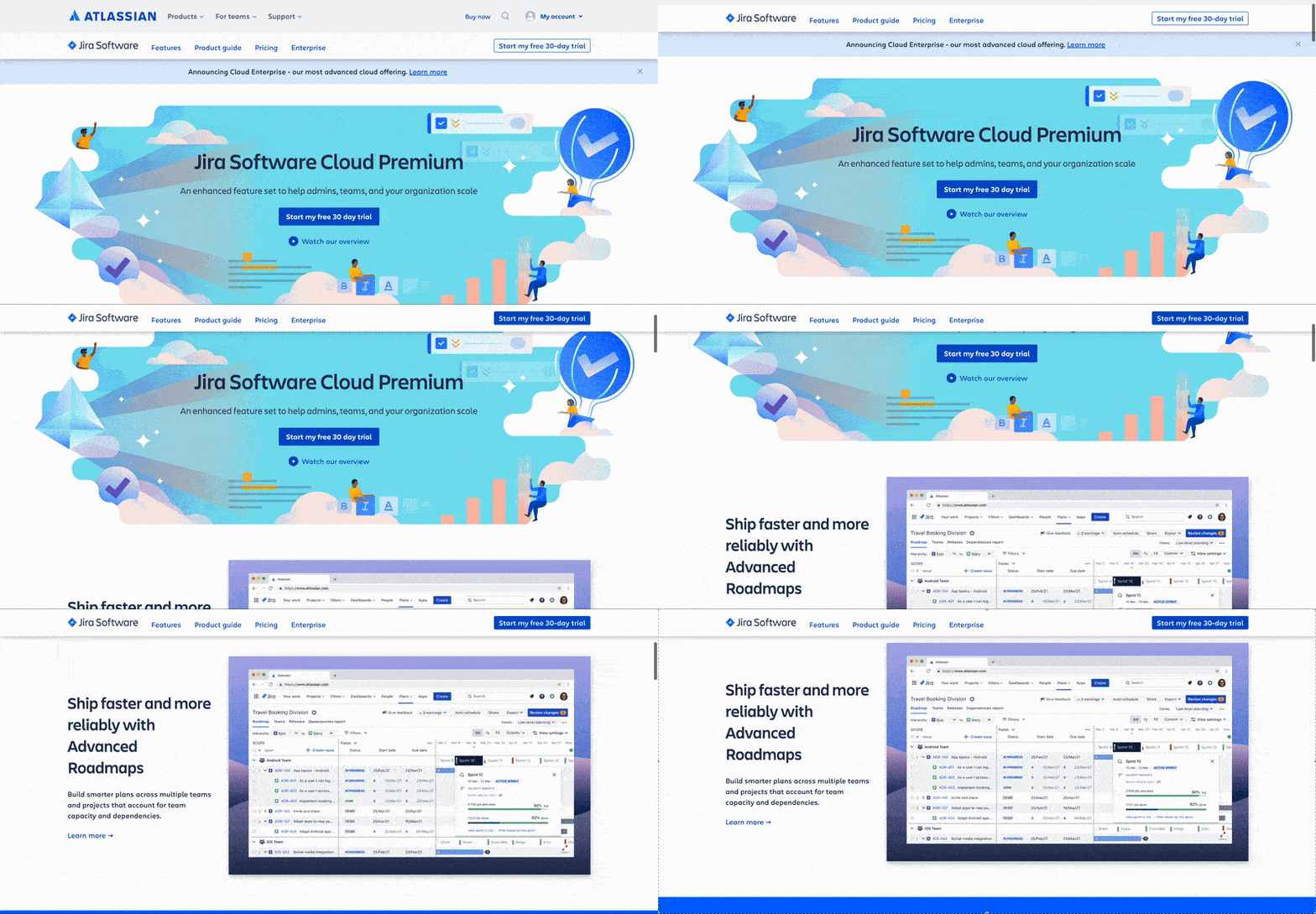
Atlassian has a call-to-action prompting the visitor to start a 30 day trial. If the visitor isn’t ready to do that because they need to learn more about the product and they scroll down, the top navigation menu scrolls with them. The previously outlined 30 day trial button, has a blue background added to it, bringing more visibility to the button and always providing the visitor with the ability to start their trial.
#2 Figma
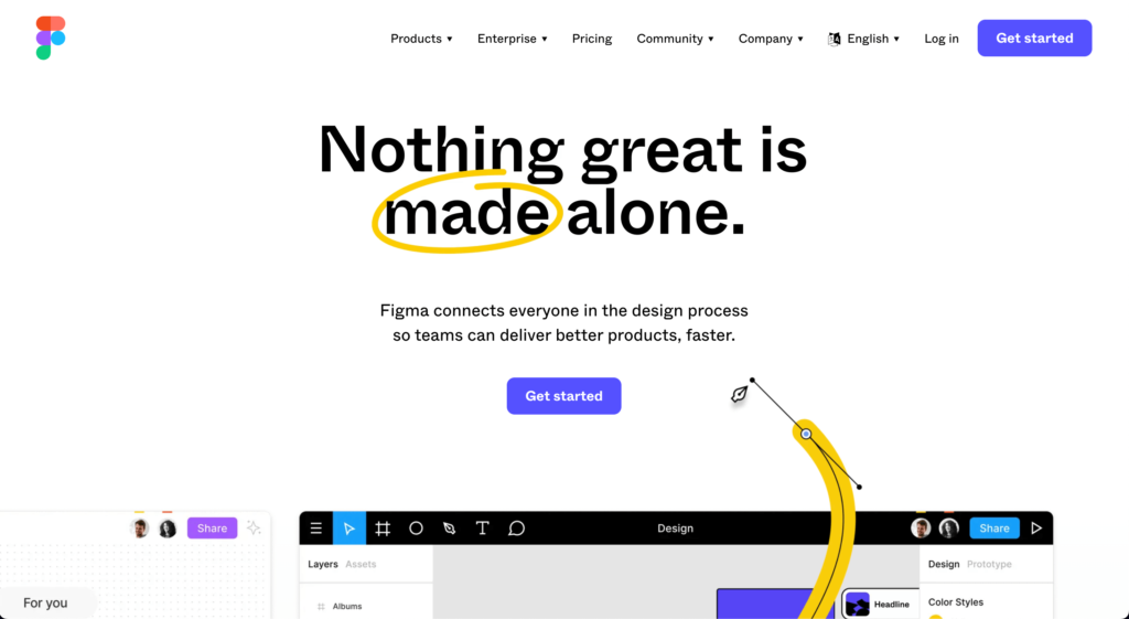
Figma provides the visitor with one main get started button and captivates their attention with its background animations. This grabs their attention and gives them a single clear direction to go in. If they aren’t ready after they first land on the page and continue to scroll down, the Get Started button from the navigation header scrolls with them, making it easy for the visitor to purchase a plan.
#3 Elegant Themes
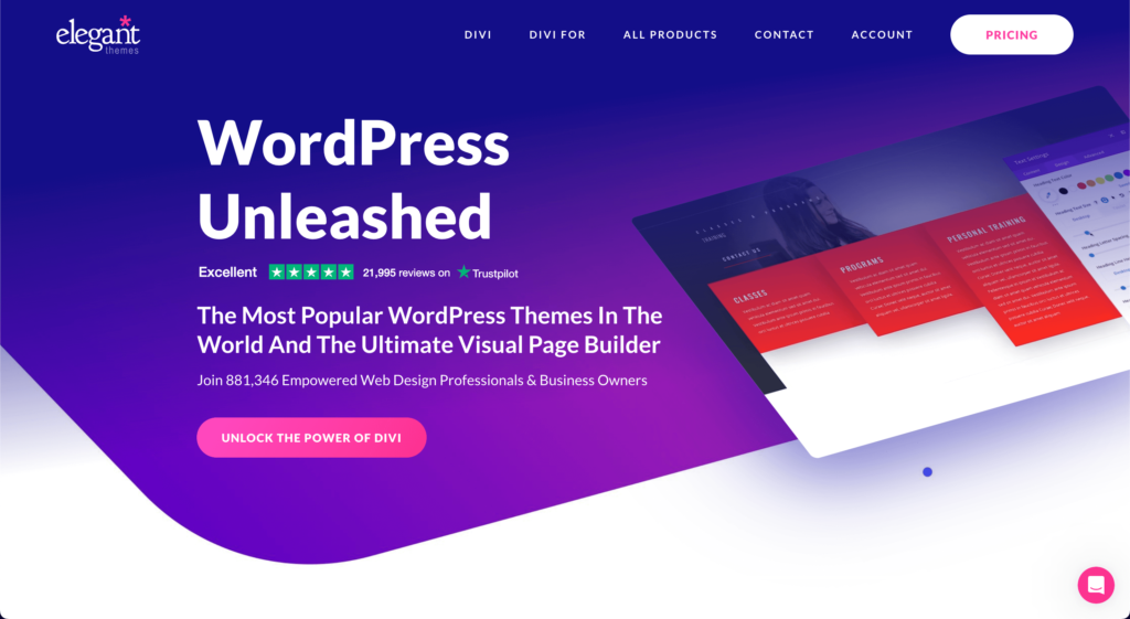
Elegant Themes is another great example of using animations to draw and keep a visitor’s attention while providing one main action they want their visitor to take. The big difference between Elegant Themes and the other examples so far is the button in their navigation header. The button they are displaying takes the visitor to the pricing page and the main call to action takes them to the Divi Builder product page. Another unique item in their call to action is their reviews. They use their animations on the right to draw your attention and get an idea of how the product works, the reviews to build instant trust and then the call to action button to purchase the product.
#4 Banner Health
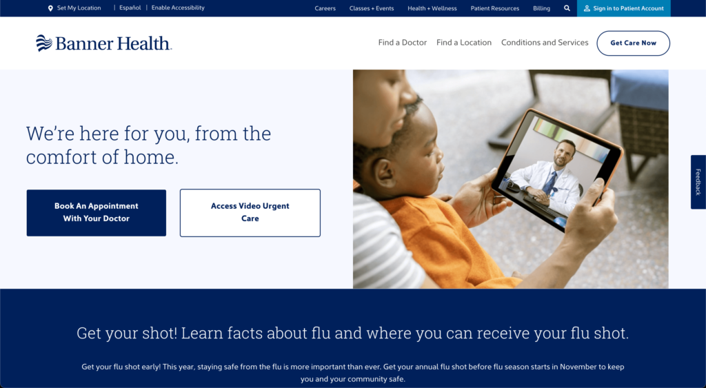
Banner Health is a great example of establishing a clear hierarchy with their call to action. They provide their visitors with two options to choose from. The first button is clearly defined by the dark blue background which immediately draws the visitor’s attention. The second button is clearly a secondary option with the background nearly matching the page background and the button only being highlighted with a blue border. This type of design makes it clear to visitors what they should be focusing on or what their visitors are commonly looking for.
In conclusion, an effective call-to-action is an essential component of any website, and can make a significant impact on your bottom line. By following the tips outlined in this article, you can create a compelling CTA that drives conversions and boosts your success. If you are looking for professional help with your call to actions, website design or SEO and Marketing, reach out to us for a chat!
